

A new face for Inflection
Looking back to look forward

We are certainly not designers at inflection, but we like to think that we have distinct taste. Mainly in founders and companies, but also in the books we read, the music we listen to, the funds we like to collaborate with, and the problems we think about. You might call it “vibe”, but it makes it sound like something we picked up off of TikTok, so let’s go with taste instead.
Taste is quite clearly expressed in how we communicate, including visual, textual and verbal cues. We sense it subconsciously - in a pitch deck’s title page, or a company’s landing page. How do you explain what your company is? Do the details matter to you (font choice, I’m looking at you), what imagery do you use? For the stage where we invest, we don’t think you need to have a designer put together an advanced corporate identity, that would be putting the horse before the cart. But everything is a choice that tells us something. Black on white vs. white on black. Attention to detail or fast and loose. Scientific versus corporate versus artsy. Bold or boring.
How you express the identity of your company informs who you attract, as employees, investors, and customers, and is a reflection of the thing that unites all the people working towards your company's future. There is a clear dilution as companies get bigger and get more responsibilities towards shareholders. From attracting alien talent and smart capital in the early years, many identities dilute just to not offend anyone. But if you are like us, you are likely in a position where you would rather attract the top 1% of your target demographic and repel the rest.
We created Inflection in 2019 to back founders others wouldn’t. The urge to create such a firm felt overwhelming at a time when most venture dollars chased the next SaaS or market place business. Powerful ideas and alien founding teams were overlooked, especially by European venture investors. Our ambition was to reclaim venture’s origins by backing engineering moonshots that matter. We wanted to create a firm that is rooted in craft and character, not another soulless startup factory chasing AUM.
Looking back
Raising a fund from scratch is the hardest thing I’ve done in my life thus far. Being hit by a global pandemic after getting the first commitments 9 months into the journey didn’t help. We had no resources whatsoever, hence I drafted the first websites myself. Over time we got some serious support - shout out to Futur Drei (v1), Herd, Maksim and Obys (v2, 3).


In hindsight our previous iterations feel very zeitgeisty. We wanted to stand out as a firm doing things differently. Bold, alien shapes and themes rooted in the navigation of new frontiers. Gradient colours to represented a continuous process of transition into the new. This was great for some years but as soon as we started getting too many compliments for the design (especially from LPs) and others started copying the look and feel (you know who you are) we felt motivated to move on.
We wanted to focus more on the craft and timelessness of our business. Getting closer to the essence of who we are and what we do. Something that felt more connected to humanity’s past and future.
Looking forward
We took a few steps back and got to first principles. A shout out to Lundgren Lindqvist, a Swedish design agency that helped us understand ourselves better and communicate it to the outside world.
Absorbing the patterns of progress lies at the core of what we do. Breakthrough innovations aren’t developed in a silo. They are closely tied to a network of previous inventions. Studying those is a necessity for getting a sense of where we are and what might be possible. It is a study of history in a way. Our approach is to spot inflections, deep but not always obvious shifts in technology, geo politics or culture that enable a change of behaviour at a large scale. I’ve been writing about it in depth here.
The farther backward you can look, the farther forward you are likely to see.
Winston Churchill
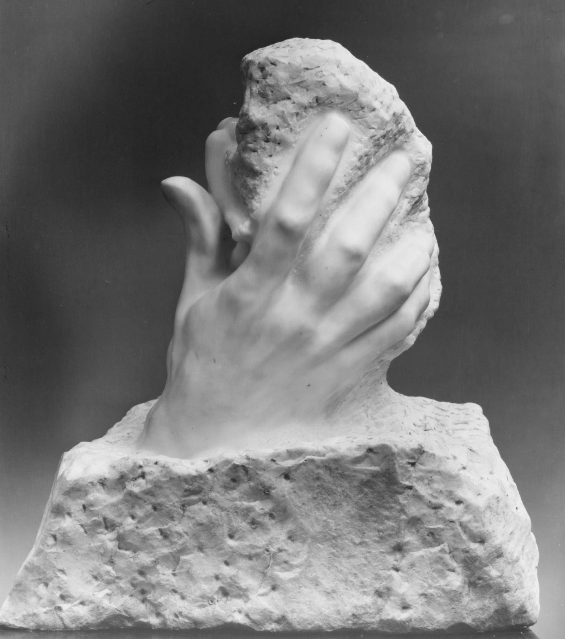
We also were in search for something that associates us closer with the divine act of creation. Building something from nothing with passion, dedication and skill.
Lundgren Lindqvist found a perfect representation of such ideas in Janus - the roman god of new beginnings, transitions and endings. His two faces empower him to look into the past and the future at the same time. Domains he governs are (1) time: the shift from past to future, (2) space: thresholds, doors and gates and (3) actions: the start of new journeys, projects and decisions.
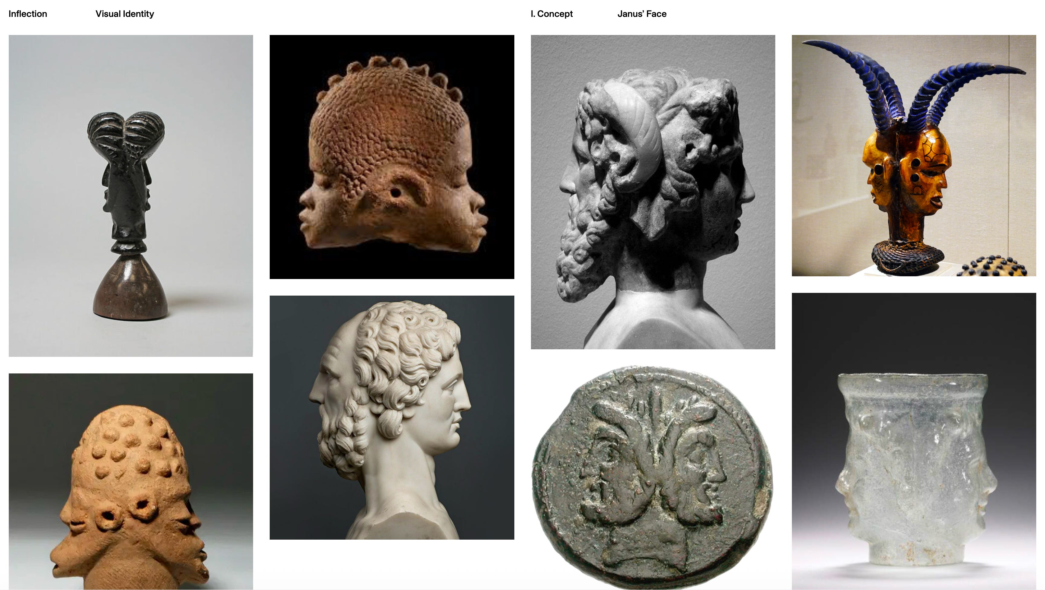
From this basic idea, a new Logo was born. A shape that resembles the Janus representations while also reminding of an adoption S-curve that flows from bottom left to top right. It also reminds the shape of an “I”, the first letter of our firm’s name.


Building on this foundation we wanted to use timeless, crafty imagery that has a somewhat retro sci fi touch and dreamy touch to it while also representing boldness and reality. We experimented with various AI prompts to get it right. Here are some examples:


Our colour palette reflects optimism and calmness. We went with a modern, minimalist sans serif type font.


We also found a new home for our website. It should represent better who we are and the platform we are building for founders and investors. Check it out:
As always, we’d love to hear your thoughts.
Love this!